 I'm
going to kind of throw away my standard layout for the figure reviews and not
worry about breaking up the qualities of these toys quite so much. I'm just
going to grab them figure-by-figure and have at it.
I'm
going to kind of throw away my standard layout for the figure reviews and not
worry about breaking up the qualities of these toys quite so much. I'm just
going to grab them figure-by-figure and have at it.Comic Book 3-Pack Issue #1
Baroness, COBRA Commander, COBRA Trooper
Toy
name: Baroness, COBRA Commander, COBRA Trooper w/ Comic Book
Assortment: Comic Book 3-Pack
Asst. 1
Price: MSRP $9.99
Availability: July 2004
Who would have thought?
Has it really been twenty years? Twenty years since I first saw characters in the comic books come to life and twenty years since I ran to the toy stores looking for the new Kwinn, Dr. Venom, and Oktober Guard figures, only to come away disappointed.
I've said this countless times, and I'll only say it again, because it really applies in this case (as opposed to the hundreds of other times I said it, when it only partially applied...). I like uniformity. Uniformity in my comic characters and action figures...or even cartoon characters and action figures. I like seeing the figures I'm using come to life on the page and on the screen, as close to accurate as possible. Back in the days of G.I. Joe, this just didn't happen. Scarlett grew long hair, Lady Jaye tossed out her hat, Destro's mask shrank and his collar grew...everything was just completely different. Well, things are getting better now...and it only took twenty years.
 I'm
going to kind of throw away my standard layout for the figure reviews and not
worry about breaking up the qualities of these toys quite so much. I'm just
going to grab them figure-by-figure and have at it.
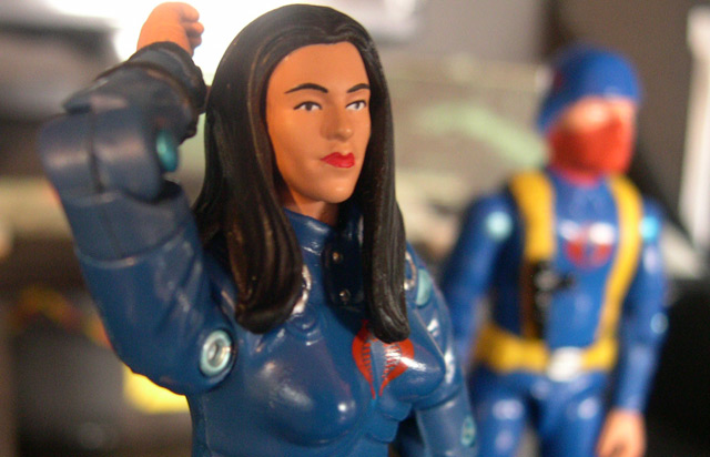
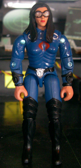
First we get to The Baroness. So far, as far as comic accurate figures go, she doesn't do so hot for the first figure out of the gate. She doesn't even come close to resembling the Baroness shown in issue #1, still sporting her angular body armor and COBRA adornments. But, this is a first for Hasbro...these comic packs are still in the very early stages, and I can see how they would want to tread carefully, so as not to throw too much money at something that might not generate a great return for them.
For what Hasbro had to work with, I think they did a decent job here, I suppose. They matched the blue of her comic uniform here, and use this solid blue base to nicely tie all three of the COBRAs together. I've heard countless complaints over the years about the various shades of bright colors that COBRA gets saddled with, but n one compolains about the classic COBRA blue, and for good reason. That's COBRA's color, and they wear it pretty darn well.
Her mold does look a tad dated over the years, yet I would have to say, that this is definitely her best mold. The older molds' slimness is not so bad on the female figures, as they are usually percieved as being slimmer anyway, and she still fits in nicely with the new sculpts. The layered armor is a Baroness trademark by now, and while it doesn't resemble how she appeared in the comics, it does look nice in this blue color...what has me questioning, though, is that we've gotten Baroness figures with this mold over the years several times, and even one in a color scheme close to this one...did we really need this figure released? I would have almost rather have seen the standard COBRA Trooper and the COBRA communications trooper...you know, that guy with the red mask, no helmet and the earphones. That would have been very cool.
Still, the Baroness is an iconic figure in Joe lore, and I suppose it was only right that she be released in this figure issue pack, since she was a pretty large part of the issue.
One further step that Hasbro took as well, just to make the figure new and exciting, was a brand new head sculpt. I think the head sculpt looks terrific, personally. The new hairstyle is dramatic and effective, and her face is well molded...she looks attractive, yet not a nice person...exactly how she should look. But of course, as with every Joe release, there is a bone of contention here amongst the online Joe fandom, and that involves her removable glasses.
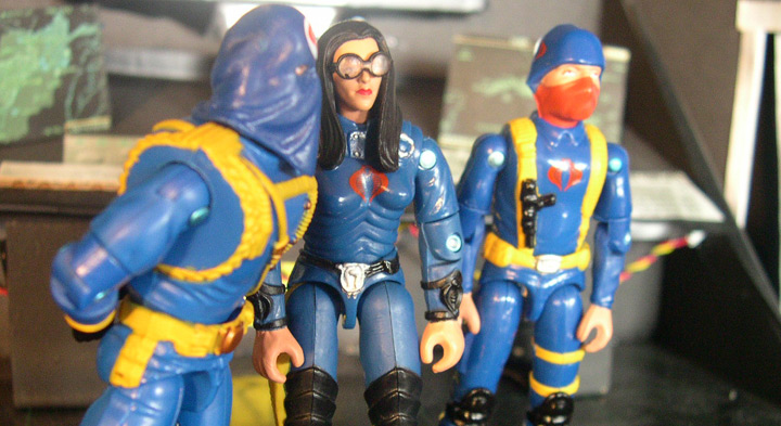
I can see why Hasbro did it...as you read issue #1, The Baroness ends up in disguise near the end of the issue...when Stalker removes her wig, there she is, without her glasses. I think her removable glasses are meant to be a tie-in to that part of the comic, and it works well in that regard. The issue becomes, how the heck do you sculpt realistic 3 3/4" scale eyeglasses? The answer is, you can't. At least not well.
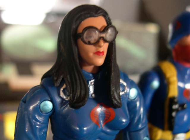
The glasses here end up looking like big, bulky racing goggles, which is unfortunate. It's very nice to see that Hasbro is trying to come up with new and different ways to spice up these re-releases, but sadly, this particular step did not execute very well. I think the bulk of the fanbase would have rather seen her with sculpted glasses on her face, although a new female head without glasses is something that the Joe customizing community is always on the lookout for.
Overall, my feelings on this figure are pretty mixed. A slightly dated, although still-effective mold...a very nice color scheme, but nothing really new or exciting...a decent head sculpt, but looks silly with those big coke-bottle lenses. Not a really exciting first entry into the Comic Book 3-Packs, but we've still got plenty to go!
 I
have said all along, that my favorite version of COBRA Commander in the Real
American Hero style has always been the mold we got with the talking Battle
Commander. Even with the barrel-chest and the broad shoulders, this was the
COBRA Commander everyone wanted to see...a regal, simple mold with basic details,
but all the trimmings of a terrorist dictator. Everything that the original
hooded COBRA Commander strove to be just fell a little short, in my opinion,
and left us with a scrawny, unthreatening man in a hood, where the newer mold
was bulkier, more intimidating, and just plain cool.
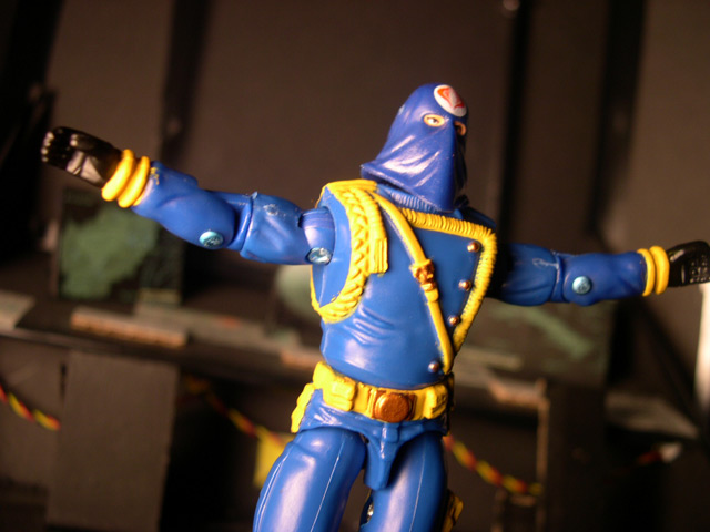
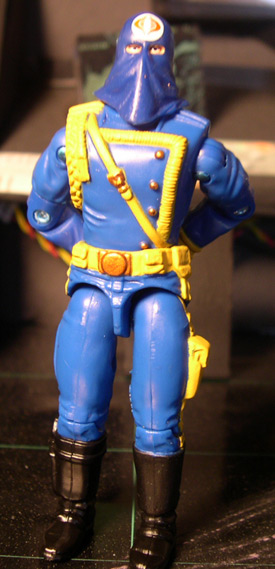
While the mold itself hit perfection with the 2000 original Wave 1 Real American Hero Collection, there was one part of it always missing...a decent hood. The head given to that figure from day one looks just short of rediculous. A short, floppy little hood, it didn't drape realistically or look like it even should have covered his whole face. This result is a head sculpt that is less-than-intimidating, even though the overall mold of the body looks great.
Well, that has all changed now!
It is unquestionably obvious that the biggest draw of this figure is, without a doubt, the head sculpt. His body has been reproduced what seems like dozens of times, and even in a color scheme very close to this one the first time around. Luckily this time we got a more tan color for the trim and belts instead of the ultra-bright yellow of the Talking Battle Commander version, which does make a big difference. Not only does it look more reaslitic (and more in tune with the comics) but it blends nicely with the tan trim of the other figures packaged with him. A great overall theme.
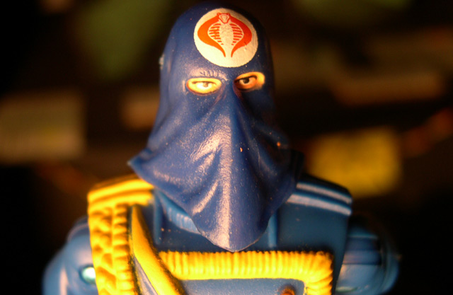
But Hasbro didn't just make the head sculpt more dynamic and dramatic, they made it to closely resemble how he appears in the comic, with the bridge of the nose upturned and a nicely sculpted drape down over his chin. As a final touch, they added the white circle around the COBRA symbol, and while it doesn't look terrific asthetically, it does look very comic-accurate, which is excellent.
So now we seem to have the best of both worlds...the great, dramatic, and intimidating body mold from the Talking Battle Commander...the equally threatening new hooded head sculpt...and a great new blue/tan color scheme to match the other figures in the pack. This COBRA Commander is definitely the default one I will find myself using when using the old sculpts...he still doesn't overshadow the fantastic Wave 8/Valor Vs. Venom versions, however, and I really hope Hasbro might consider re-working one of those molds with a hood like this, as I think that would look incredible.
Overall, even with just the small added touch of a newly sculpted head, this figure looks nice and is definitely the pick of the pack. For $9.99 you can grab three figures and a reprint of one of the classic era Joe comics, which is a deal and a half...this figure's head sculpt alone almost makes it worth the price of admission.
Just looking at these pictures makes me smile a little bit...for these packs, Hasbro really seems to be going out of their way to make something very collector-oriented...not something they've been known to do in the past. Even though some of these figure release packs miss the boat a little bit, I applaud them for their decision making and their steps in this direction, and I am unbelievably excited to see what the future brings with these packs. The Oktober Guard cannot come soon enough, and after that...well, who knows what we'll get, but I'm hoping for good things.
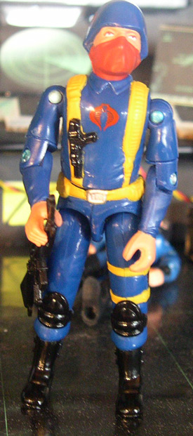 I
find it curiously ironic that in the other two figures of this set, it was the
new sculpt head that really saved the figures and made them cool, and desirable,
while this third figure, the lack of a newly sculpted head negatively affects
his desirability, at least in my opinion.
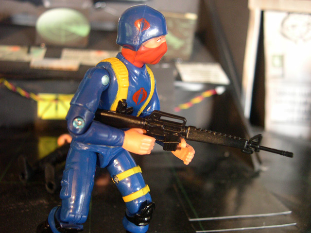
I'm not sure how widespread my thought process is, or how many Joefans out there share my opinion, but I loved the new heads given to the Infantry soldiers in the TRU six-pack. The old heads look chubby, bland and lack serious detailing compared to sculpts from even a few years later and up. Just like the faces of the original 13, they look generic, non-specific and pretty boring. Hasbro was able, now over 20 years later, to maintain the feel and the anonymity of the faceless troops of time past, but add some detail and some life to the head sculpt, which made a world of difference in my mind. Without these new heads, I honestly don't think I would have bought the number of packs that I did...they just have more feeling and character. There are those out there that would prefer to see the same figures released in the same paint scheme over and over again...and they claim that's what "all collectors" want...I honestly cannot get my mind around that line of thinking. Personally, I already have a handful of original COBRA soldiers. We're getting the essence of what makes them great, but we're getting some altered parts and at least a little creativity...where's the crime in that? If you just stand this COBRA Trooper next to one of the Infantry sets, it becomes immediately obvious just how dated the original trooper's head is and how much it effects my desire to own this figure.
Beyond that, Hasbro did a fine job color-matching not only the other two figures in the set, but also how these troopers are represented on paper. The solid blue uniforms w/ red masks and tan straps is a way the troops have been portrayed in the comics since the very beginning, and it's nice to see them authentically represented. The addition of the COBRA logos to the sides of the helmets were also a neat idea, and pulled again right from the pages of the Marvel comic.
I do like the original COBRA soldiers...they make for good support troops and faceless infantry (not as cool as Vipers, though, IMHO) but with the same old head it just makes the figure look too dated. I really like the face that this figure will work great as an LBC Scarface custom (not as good as the officer will once we get that one in issue #5, though...) and the way he integrates with the other figures...but overall, I ended up with scores of the new sculpt head troopers...and I think I'll probably only end up with a few of these. Not even because I want to army build, though, more because I want to support the comic packs.
It took Hasbro 20 years, but they are finally making a solid move towards answering a lot of collectors' desires over the years. Figures based on their representation in the comics and new figures based on previously comic-only characters are a terrific idea, and I plan to support it heavily. Even if some of the individual offerings are somewhat lackluster (as this COBRA Trooper is...to me, at least) there are so many figures that I want to see...and so many indications that Hasbro is going in the right direction with this series, that I have to support them and show them that we are willing to spend money on these figures.
So bring on the Oktober Guard! I'm ready to finally get them in my collection.
Ratings (out of 10)
Characters:
7.5
Molds: 6
Paint Apps: 4
Value: 8
Overall score (not an average): 7
