 First
we start off with the team leader...Duke.
First
we start off with the team leader...Duke.G.I. Joe Anti-Venom Task Force
Toy
name: G.I. Joe Anti-Venom Task Force
Assortment: N/A
Price: MSRP $19.99
Availability: August, 2004-
Toys "R" Us Exclusive
Well, I must say I was surprised to see an early release for the Anti-Venom set...the TRU six-packs normally get spaced out pretty nicely, but the COBRA Urban Strike Team and the Anti-Venom Task Force ended up being released within a month or so of each other.
It's funny, too, because I see some parallels between the two sets...although these similarities seem to point to opposite results. Confused yet? Yeah, me too.
The Urban Strike Team looked to be another sub-standard set with some poor mold choices and lack of trooper figures. However, they executed the set very well, releasing the character figures with terrific new paint schemes and injecting some great life into what could have been some tired molds.
On the other hand, the Anti-Venom set looked really nice on paper (or on eBay, as the case may be...). A good number of molds we haven't seen in recent times, some interesting character choices, and a cool new paint dynamic. Contrary to the Urban Strike Team, though, the execution of this set seems to take a sharp downturn compared to how things were looking. I can't really point my finger as to why, since the figures look much the same in person as they did online, but I guess face to "face" the figures just don't have that "zip".
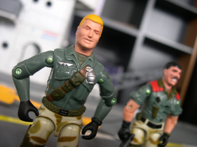
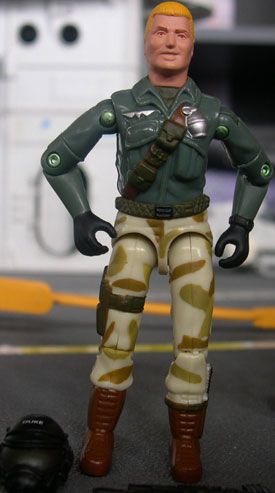
First
we start off with the team leader...Duke.
I can't think of many people who really like this mold very much, although I don't have any huge problems with it. The fact that we haven't seen it in wide release since 1997 makes me happier, but it doesn't even come close to saving what is essentially a throw-away figure.
My same complaint that points to nearly every figure pre-1985 definitely comes into full effect here, especially with this figure coming mixed with a number of newer molds. Duke, for being the G.I. Joe "Top Kick" comes off here looking skinny and scrawny, and that goofy grin does not help things in the least. His torso is decent enough, maintaining the detail-work from the original, and most well-known uniform, but his skinny legs just add to his less-than-intimidating appearence.
Then, we have these arms. Oye. Tossing the '84 Roadblock's arms on Duke just makes no sense whatsoever. They only serve to make Duke's already scrawny mold look even more twig-like, and the fact that they try to pass off bare arms as long sleeves on a shirt just makes me confused. There are hundreds of arms out there they could have used to actually make Duke's sleeves look like shirt-sleeves, but they seem content to just toss whatever arms they can find on there and try to squeak by. It just doesn't work in my opinion.
The paint apps don't really help either.
The strange combination of dark green and a tan camo pattern didn't really look all that strange in proto shots, but in execution it just doesn't flow all that well. It isn't any more obvious than it is here on the Duke figure. The odd green shirt over the tan camo pants just does not flow well, as it seems like it cannot make up it's mind as to what environment these figures are going to belong in. The pants seem to be for a desert operation while the shirt looks to be too odd a color for a jungle scheme and doesn't really fit anywhere.
Add this to this strange painted flesh tone and almost too bright blonde hair and the figure just looks a little off and does not work. Especially among some of the other figures in this set who use some really nice, bulky molds...this Duke just looks sickly.
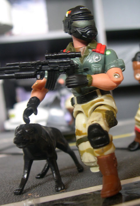
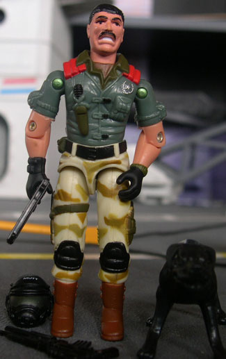 Next
we have the the most well-known Joe dog-handler, Mutt with his equally well-known
dog, Junkyard.
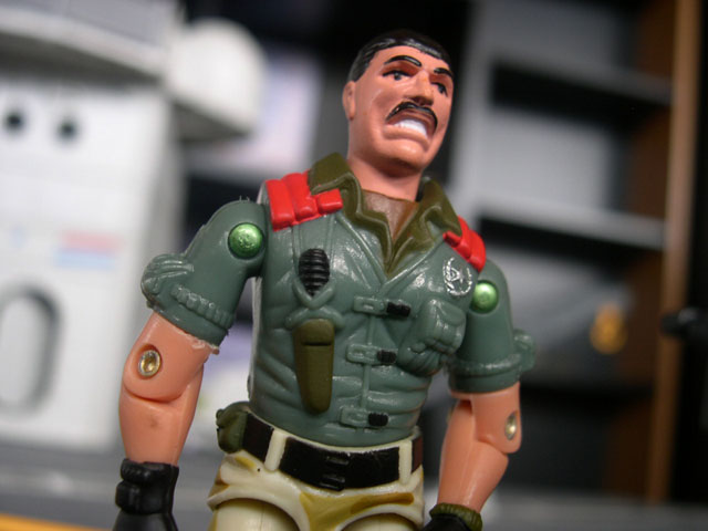
Next
we have the the most well-known Joe dog-handler, Mutt with his equally well-known
dog, Junkyard.
By some appearances, Mutt suffers from many of the same pitfalls as Duke does. A pre-85 mold, this figure looks weak and scrawny next to the larger Joes included with this set...and not only that, but like the Duke figure, Hasbro has substituted lost parts with componants that make this figure look even skinnier! Yeesh.
First of all, though...it's time for a confession. I'm really not a Mutt fan. I don't even know why, but Mutt has never really impressed me, especially in his first incarnation. I kind of dug the DEF figure (and the ensuing Battle Corps version) but the first figure just didn't do anything for me. I'm not even sure why, since it has some great trademarks like the cool layered shoulder pads...the nicely detailed, scarred head sculpt, and the large dog-handling glove. Even though none of these things appealed to me, they were a big part of why this figure was so popular back in the day, and unfortunately many of these aspects are absent in this figure.
First of all, it almost looks as if the parts used from the original Mutt figure were resculpted for this set. The face looks slightly less detailed and doesn't retain the cool scars of the original. Add that to this new painted flesh and the new head just looks strange.
The torso sculpt looks accurate enough, and maintains the nice detailing of the original, but that only goes so far, especially when Mutt's original arms are replaced by the '86 Wet Suit's. These are arms that are supposed to go on a figure with a skin tight diving suit, yet they are being passed off as short sleeves and like the Duke figure, it just does not work, especially since one of his trademarks is a large, bulky dog-handling glove.
Mutt's legs were also replaced, and like the arms, the legs a tad skinnier than his previous versions, and only add to making the figure a lot less intimidating than previously.
The paint apps fall into a lot of the same traps as they did on Dukem with the strange combination of green and desert camo. It's not quite as jarring with Mutt, simply because his bare arms help set off the green shirt. I do like the brown collar showing up underneath his overshirt, and the red pads on the shoulders offset the drab green and brown colors nicely.
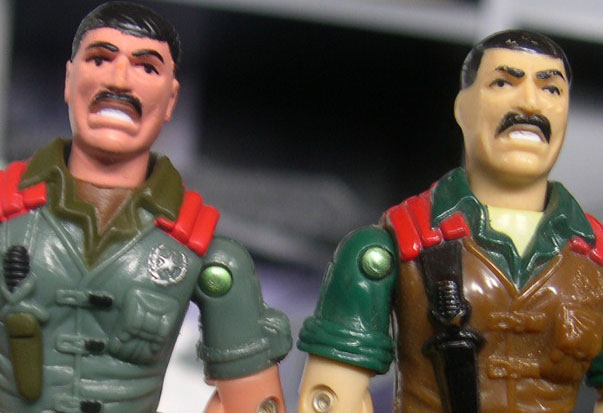
All in all, Mutt is somewhat more successful than Duke, although that's not really saying a whole lot.
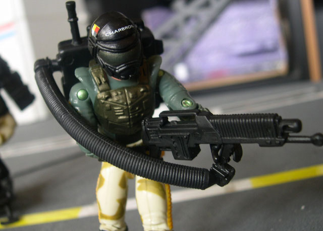
 Now
here, we finally get a figure that really should hit on all cylinders. First
of all, it's a late 80's mold that hasn't been used in nearly 20 years. Not
only that, but he gets a majority of his original accessories. The new item
that he does come with is a nifty new hollowed out helmet. Those fans like me
who really like to see new and exciting things should be happy, right?
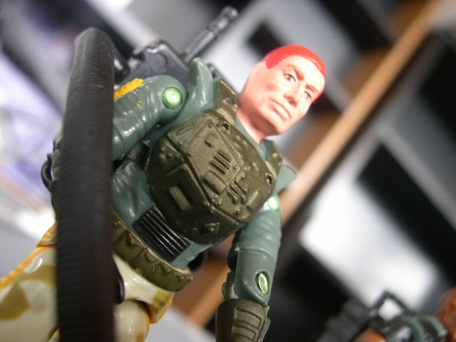
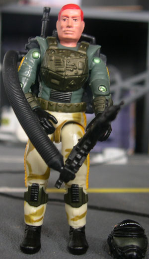
Now
here, we finally get a figure that really should hit on all cylinders. First
of all, it's a late 80's mold that hasn't been used in nearly 20 years. Not
only that, but he gets a majority of his original accessories. The new item
that he does come with is a nifty new hollowed out helmet. Those fans like me
who really like to see new and exciting things should be happy, right?
Well, yeah, but that would be no fun. ;)
Only problem is, I never liked the Charbroil figure to begin with, and this new version doesn't do a whole lot to change that. I am quite happy that his bug-eyed helmet is gone, but there are rampant problems with this mold that just turn it a little South for me.
We start off with the somewhat goofy looking head. Actually, the head doesn't really bother me a whole lot. Sure it looks a little..."different", but it does have character...not everyone in life is a blonde-haired, blue-eyed hero, and Charbroil looks like he could be a real person. But this isn't what really bugs me...what bugs me is his completely bizarre uniform.
He's covered by these strange quilted-patterned pads on his legs and arms and I have absolutely no idea what those kneedpads are supposed to be. His chest pad seems to have no base in reality just looking like a metal techno-mess with no real purpose or effect. It doesn't appear to contain any rebreathing equipment or typical flamethrower gear, and I really cannot tell what it is supposed to do.
The overall mold just seems chubby, non streamlined and just awkward...a very rare problem for the molds of the late 80's, I think, but it definitely affects the figure's playability and ends up hurting the figure in the long run. He just doesn't do anything for me.
On the plus side, this new paint scheme works much better for Charbroil than it does for Duke or Mutt. His mold lends itself to this pattern a lot better than the other two, and the fact that Hasbro didn't need to use color to try and break up body parts that were meant to represent other things makes this figure seem more cohesive and better overall. I really love the metallic color pattern on the chestplate and gauntlets, even though I have no idea what those items are supposed to do.
His painted flesh doesn't actually look too bad with this particular headsculpt and ends up looking all right. I really like the Steel Brigade helmet when used for this figure, too, and in conjunction with his other accessories (all from the original figure, believe it or not) makes the figure look at least a little better than it would originally.
So, overall, this figure is a step up from the Duke and Mutt figure and fits in much better with the rest of this set and with the new line in general, but the faults of the original mold still shine through and make this figure fall a little short of the home run mark.
Like the Urban Set, I'll post pics of these three figures, and then you can move on to page two for the rest of the figures, just so there aren't so many pictures on one page for you dial up folks. ;)